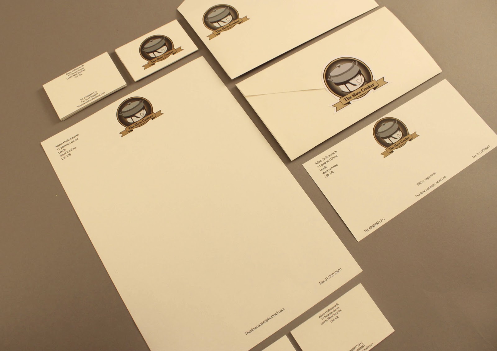
Friday 22 March 2013

The Slow Cooker.

I am really happy with the stationary range, here are the final outcomes.


Thursday 21 March 2013

The Slow Cooker

Letterheads.

I applied the logo to a stationary range.
A letter head,  business card, compliment slip and envelope all printed  on
'Antique white' to keep a consistent look of the range. 
They were printed digitally CMYKfour colour process 
It also adds to the dated and traditional theme because of the texture and feel throughout.


The letterhead, business card and compliment slip all have Adam Hollinsworths information in relation to 'The Slow Cooker' business.

The two sides of the business cards are antique white and they are duplexed between white card to add support and to give a heavier feel.


A compliment slip


The logo has been applied to the front and back of the envelope. 
The Envelope is stuck together and then a sticker is applied to the back so that which
ever way your letter lands when dropped through 
the letter box you will know it is from 'The Slow Cooker' company.


Saturday 9 March 2013

The Slow Cooker.

Moving on my my initial designs i chose to experiment further with color.


This bottom logo is one of my favourites. Its simple and works well. The fade behind lets the object sit nicely within the circles. The colours brought the logo away from the traditional and dated look. Like they had been around for a while. When in fact they had only  been established in 2012.

The Slow Cooker.

Different variations of the logo in black and white.


Introducing colour gives a nice effect. It gives the object more character and
makes it stand out more amongst the background of the circle.


The Slow Cooker.


Experiments with colour. They are vibrant and work really well.


Friday 8 March 2013

The Slow Cooker.


I really like this slow cooked pork version at first, 
I thought the meat looked amazing and complemented the logo. 
I spoke to people to get there opinions and the overall opinion was that it looked appetising. 

For vegetarians however it was a horrible sight and the complete opposite of what I thought.

I know that its not aimed at a vegetarians audience but as
I starred at the logo the more and more I  began to agree.  

The Slow Cooker

Some more experiments.I dint really like this style of shield the circle brought it all together better.


The slow cooker.

Above is the initial sketches for the slow cooker brief. I wanted to make the identity of the 'The Slow Cooker' feel quite traditional. Traditional like an emblem or pub sign.   The slow cooker is essential to cooking process and I thought i could utilise this object within the logo.

I vectored the drawing in Illustrator. 

Below are some of the initial designs. 
I like them and I feel they are appropriate. How ever I need to experiment more.


The combination of the object in the centre, 
 the added circles and the banner give it a traditional aura. 
Simple but eye catching and memorable.

I feel that  the browns make the logo look more authentic and traditional in 
comparison to the black and white versions.