Sunday, 29 July 2012

More ideas for Poster designs.

Even though I have decided to use the Boombox for the swing tags I wanted to experiment with  the boom box under a grey light. Below are the results.


I have decided not to use these because the don't have the same effect as the character. I feel the character has more presence.

'Boxhead' character development.

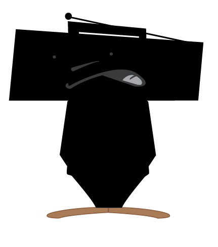
After experimenting with silhouette for the swing tag, I decided to apply the silhouette idea to the characters body and head.

This might work quite nicely as a pattern...

I like this design but its not enough. The design needs more character.

Adding the facial features gives it more character.


I experimented with reflecting the faces inside the Boombox. 
I preferred these and felt that the overall appearance of the 
character was effected by this. I will now continue to use the above 
heads and faces that face the same direction.


Foe the above three I added some hands and put the microphone in one of them.
 I felt that this made the character appear human like.

Initial ideas for swing tags.

I have made the Boombox into a silhouette
I thought that a simplified image of the Boombox would be a good idea for the swing tags.


The above images are very minimal. I have done this because I feel they are just as effective as a detailed image of a Boombox would be. You can still tell exactly what they are.

Initial poster ideas.

Below are some of my initial poster designs.
I used a spot light coming down onto the character. 
I tried to make it look like a stage with a curtain behind. However i didn't really like it.
I felt giving it a background took the focus away from the character.

The above poster design with black background appeals to me more. 
It is simpler but you still get the desired effect of the spot light on the character. 
I also made the light longer and the character smaller. I feel that this gives it a better lihgting effect.

For this design i made the spot light thinner. I feel that this gives a better lihgting effect.


The above five are experiments with a combination of different colours for the body and trousers.

I experimented with using the boom box on its own under the spot light. I really like this but feel as though the character is better for the poster. As it gives you a more human like character to engage with. I think I will experiment with using the boom box on its own for the designs of the swing tags for the T-shirts.

Development of characters head.

I experimented with putting shadow behind. 
I did this to make it look as though it was coming off the page.

I experimented with changing the outline of the Boombox and its features to a dark grey as apposed to black. I prefer the effect of this as it takes the bold sharpness of the lines away.

I took the tape cassettes away. These represented the eyes. 
I have left two dots to see the effect on the characters facial expressions.

In the above illustration the speakers are now the eyes.

'Boxhead'. Original sketch to digital image.

I chose to use one of my sketches from the first submissions of this module.
The Boombox is an iconic image associated with 'Hip Hop' culture. I felt it was an ideal image to use to create a character that would represent 'RedBulls BC One' breakdancing competition.


I used Illustrator to produce the vector drawing.