Monday, 14 November 2011

Titles included in 'The story of the Boombox' book.

The titles below were all drawn by hand by myself. I wanted to give the book a more authentic look by making the titles legible graffiti. As graffiti is a key component of the Hip Hop culture I felt it was relevant to do this and in doing so I have given the book an even more urban feel. Which was exactly what I was aiming to do.
All of the images below were first scanned in then placed into Photoshop were they were all changed to black and white and had the levels changed to prepare them for Illustrator. Once in Illustrator I transformed them into vetor images using the live trace tool. They were then ready to be placed into the layout of the book which is an InDesign document.


Wednesday, 9 November 2011

The logo for 'The story of the Boombox' book.


After scanning in the two original drawings I merged them together in Photoshop to create the imagery for the front cover and  first page of the book. 
I made the image black and white. I then changed the levels and the threshhold. I did this to prepare the image for the next stage which was to vecor it in Illustrator. I then vectord the image in Illustrator and used the pen tool  to clean it up.


Below is the final image.

Im really happy with this logo. It is perfect for the books front cover and first page. I feel that adding the graffiti typeface is essential to giving the logo an authentic look as graffiti has a huge part to play within the culture of 'Hip Hop'.


Concept revistited


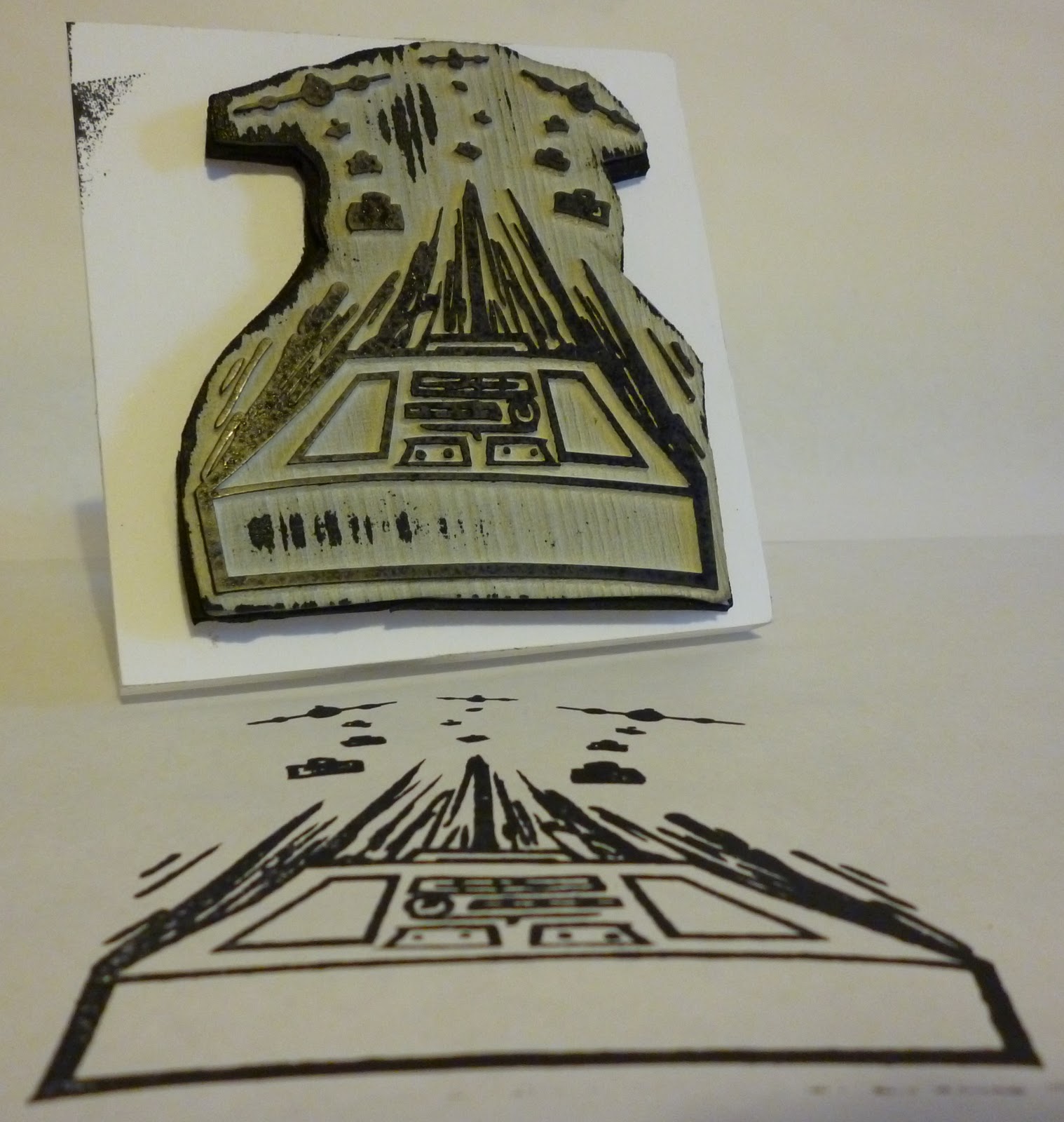
Blade rubber stamp

I got my logo made into a stamp through 'Blade rubber stamps' based in central London.


Development of concept...

Rational

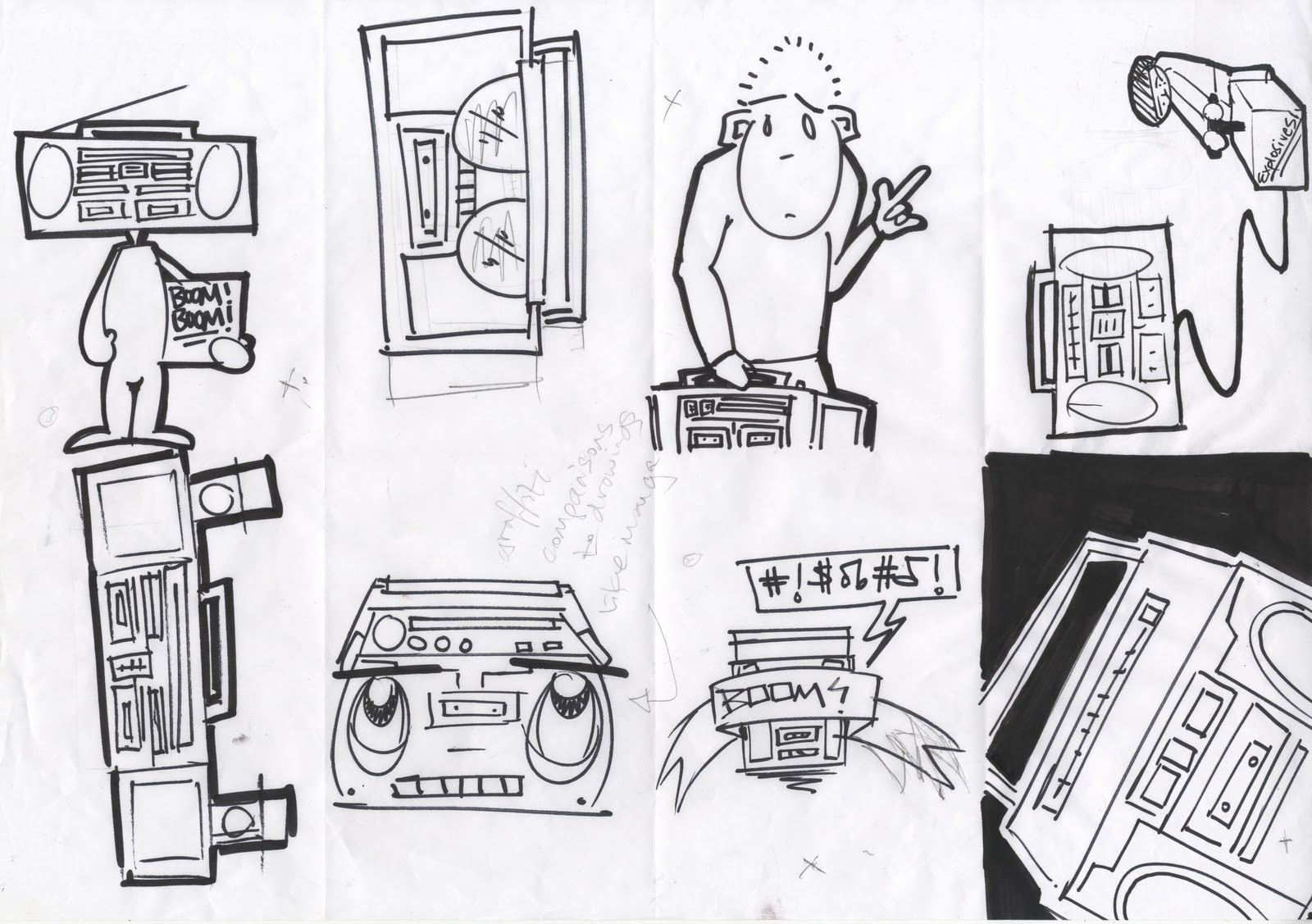
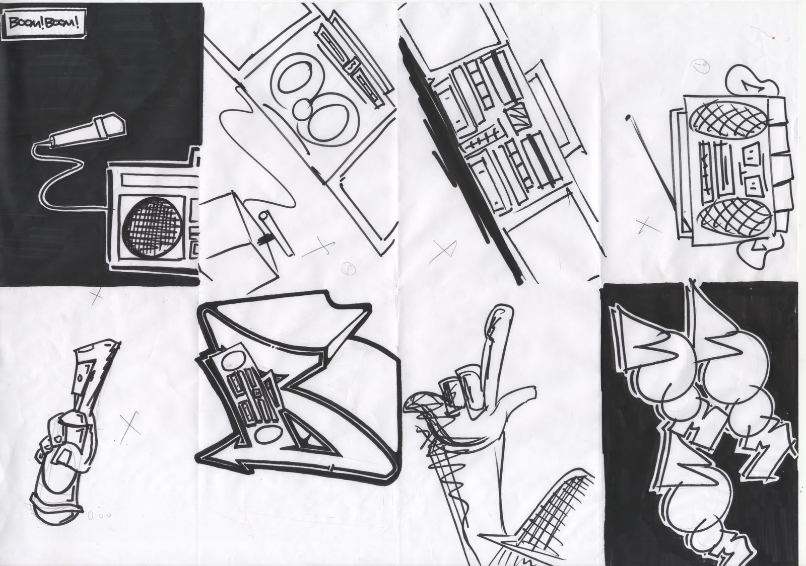
Logo design. Initial Ideas and development...

These initial ideas and sketches were produced using different thicknesses of black pens from fine liners to chunky permanent markers. I really enjoyed the development of these logos and saw a lot of development in my own drawing skills.


These original sketches of logos above were inspired by and The lyrics "Dropping bombs". These lyrics inspired me to create my logo for the Boombox. It refers to rappers practicing the spoken form of Hip Hop."Dropping Bombs" means reciting lyrics.


I really like this logo i feel it represents the boom box well. It came from the idea of someone blowing the boombox up by using explosives (you can see the development of this idea within these initial sketched ideas).


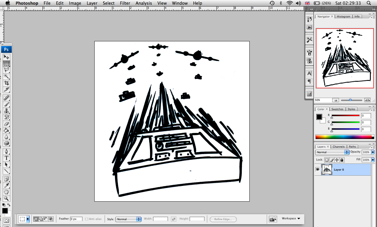
I scanned the original sketch in and placed it in Photoshop.

 Once in Photoshop I made the image black and white and 
changed the levels and threshold to prepare it for Illustrator.

Whilst in Illustrator I transformed the logo into a vector image using live trace.
I cleaned the logo up using the pen tool. 

Above is the final logo.